
data visualisation / UX / UI
2017
ENSAD Visual Explorer
ENSAD Visual Explorer (EVE) is an online app for the visual exploration of the Energy-related Severe Accident Database (ENSAD). ENSAD is a comprehensive collection of historical accidents in the energy sector over the world (e.g. floods by dams, natural gas plant explosions), covering complete energy chains.
ENSAD is available to a limited number of researchers due to its security clearance. Still, EVE can provide user-friendly access to ENSAD for the public audience, especially those who work in civil engineering or risk management.
team
Shiho Asada | Visualisation and UI Design
Sisi Salia | Frontend Developement
Kim Wansub | Data Management
data
Energy-related Severe Accident Database (ENSAD) | Future Resilient Systems / Paul Scherrer Institut
challenge
Understanding complex data
The main challenge was to visualise and analyse the geographical and spatio-temporal dataset of energy-related accidents. The dataset has multiple modalities that should be categorised. Understanding and categorising those data accurately are challenging tasks but essential to produce a clear visualisation.
process
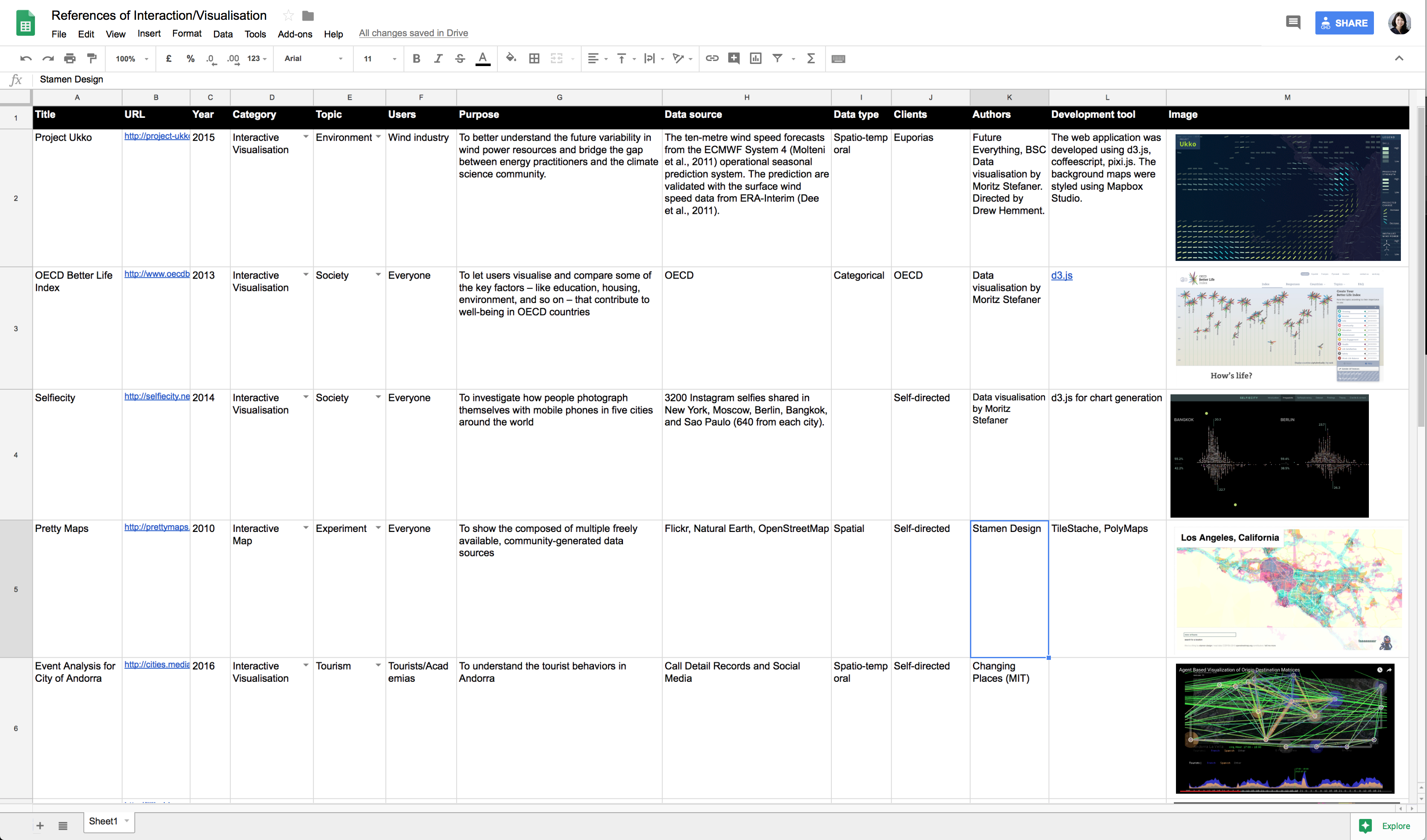
Research and analysing existing projects
I researched existing online projects with interactive visualisations, especially those using maps. I analysed their categories, users, purposes, data, etc. and sorted them out. It was a good starting point for designing EVE.
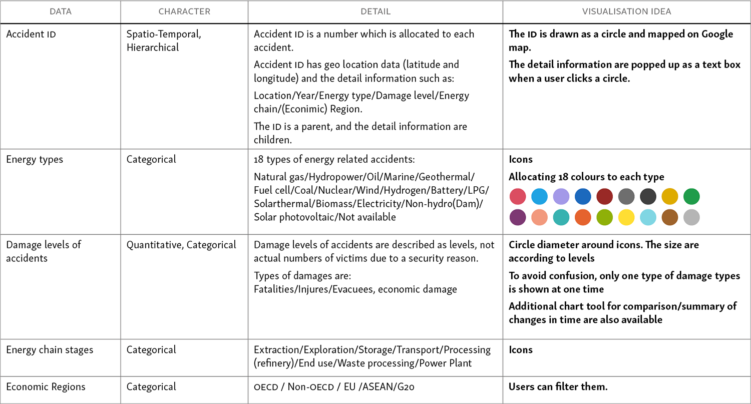
Characterising the data
The table below was made for categorising different data types, describing details and summarising ideas for visualisation and UI.
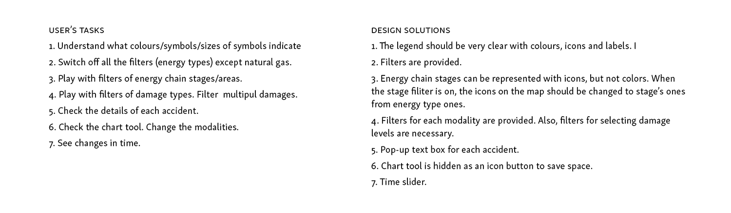
User tasks
We conducted user interviews with potential target users, including academic and commercial researchers in energy sectors and civil engineers. Based on our user interviews, I created a persona and his user story.

Prototyping & visual design
Prototype
By categorising the data, I figured out that each of the three primary data (energy types, damage types/ levels, and energy stage chains) has 5 to 18 modalities. Showing everything in one panel could be too complicated, so I divided them into three tabs. Energy types were set as the main view.
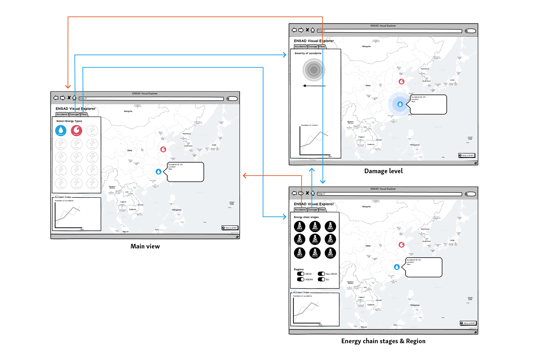
User interface
The UI includes:
- Main control panel on the left, which can filter the visualisation by Energy types, Damage types and levels, Energy chain stages and/or Economic regions
- Sub control panel on the left for filtering by year
- The optional panel under the sub-panel, which includes a chart tool
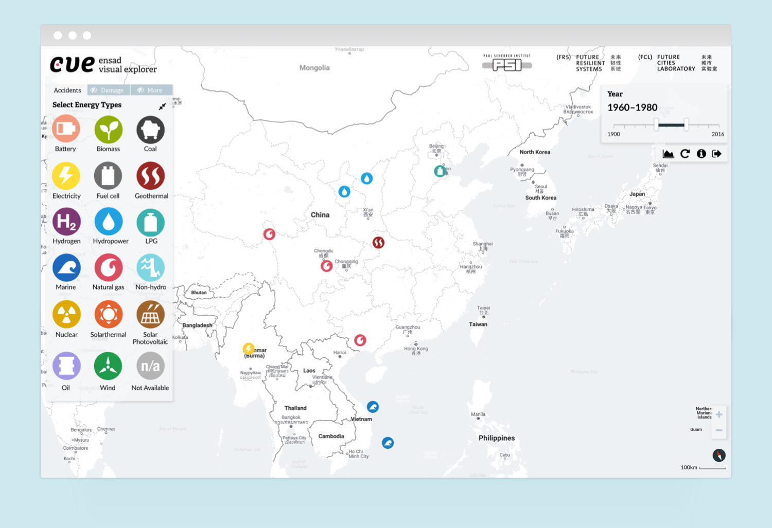
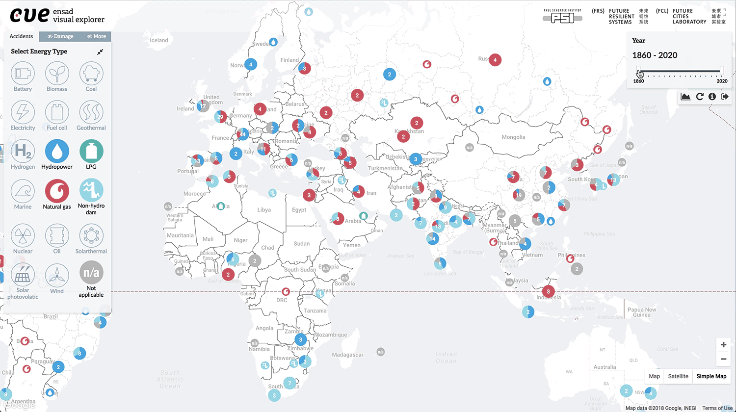
All energy types selected
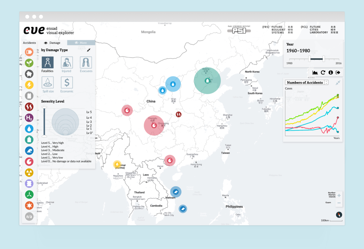
Damage type filter applied
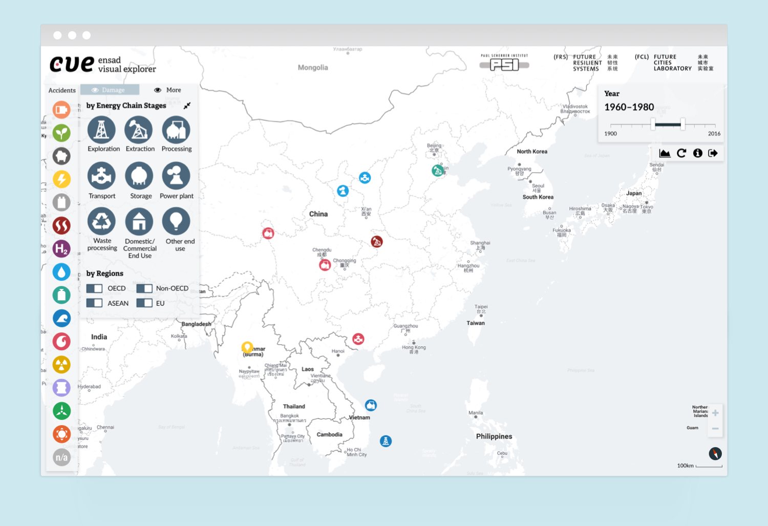
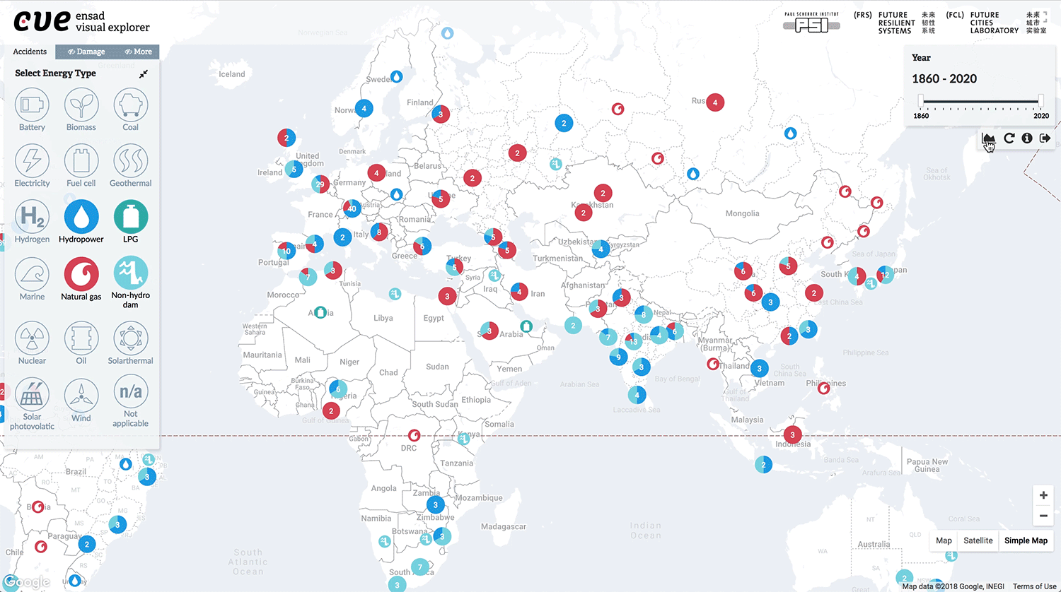
More filters applied
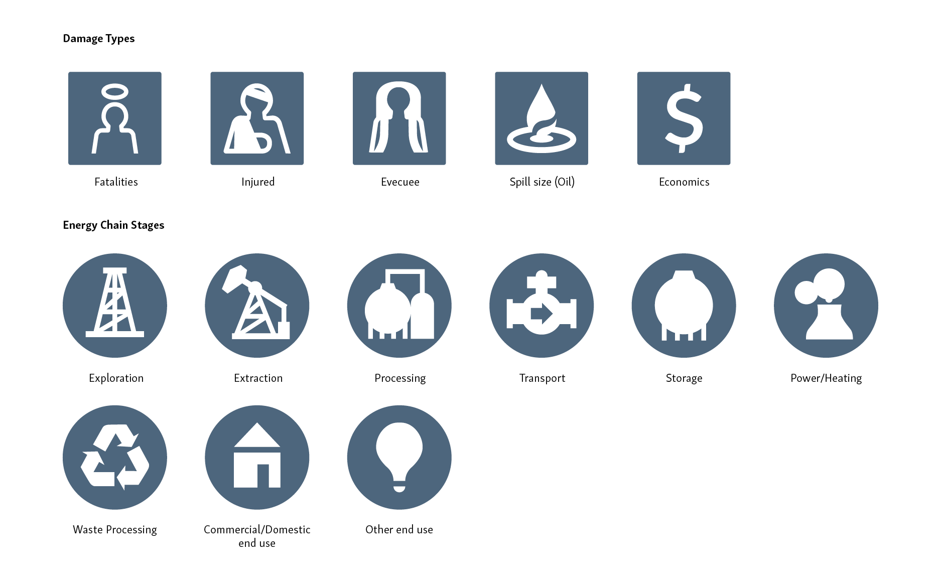
Icons
interaction
The development has so far been completed with 30% of the entire data. Here I show the interactions from recordings of the actual product.
Filtering by year
Due to a large amount of data, the accidents are clustered as pie charts. When users select a pie chart, they see the breakdown and detail of each accident. In addition, the data can be filtered by year.
Exploring by damage types and levels
By selecting the type of damage, the diameter of the circle changes. Users can also filter by severity levels.
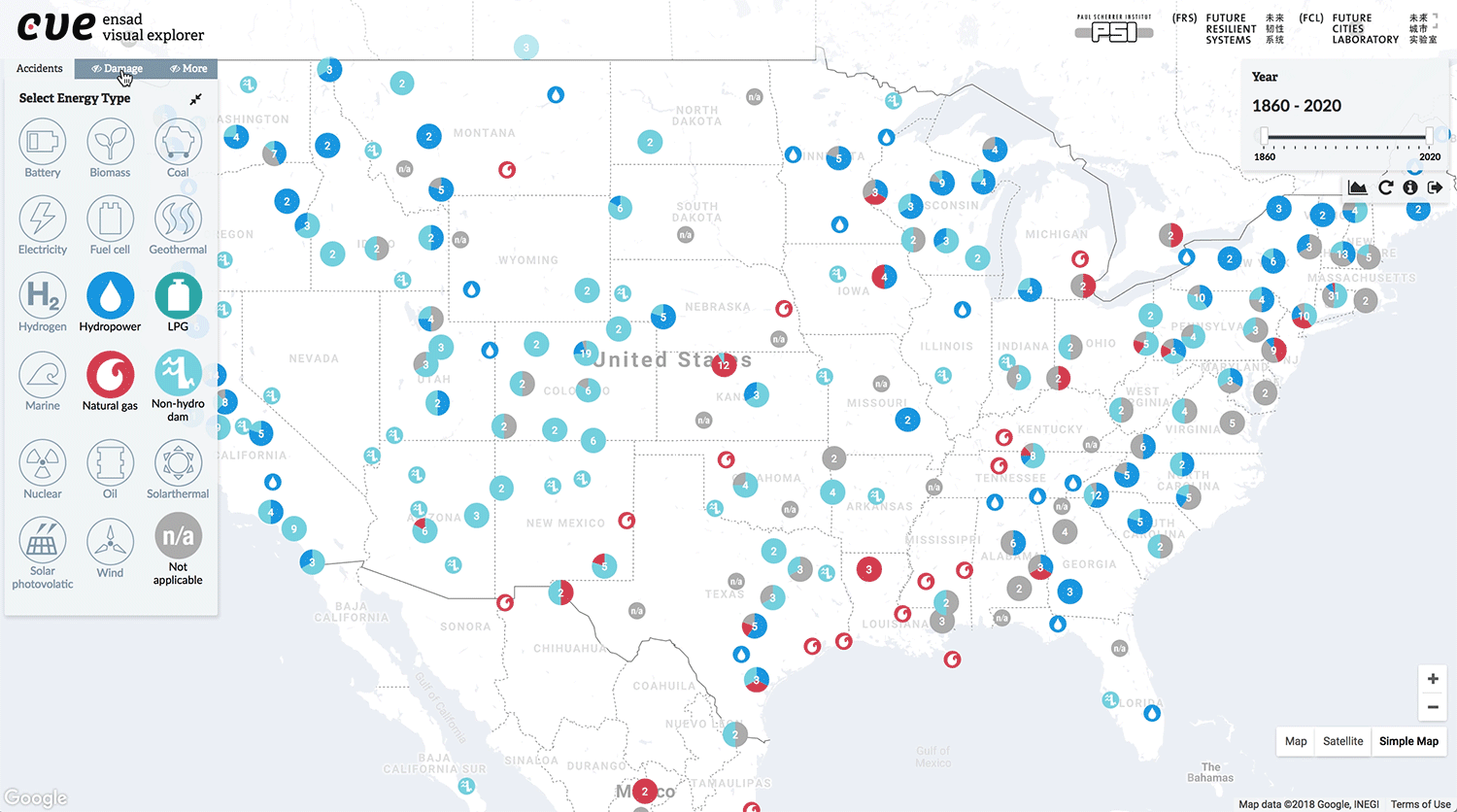
Chart tool
The chart tool is an option for further exploration. Users can play with chart styles, Y-axis and scale. The modalities correspond to filters on the main panels.
impact
Published in Big Earth Data Journal
The design proposal was mentioned in a research paper titled Energy-related Severe Accident Database (ENSAD): cloud-based geospatial platform, which my collaborators published in Big Earth Data vol 2 in 2019. The paper mainly focuses on big data management and storage.
Looking to collaborate? Talk to me.
© 2021 Shiho Asada
